We’ve had a facelift!
With help from brand agency Tomango, we’ve given our brand and website a new lease of life.
Our new logo and colours
![]()
As you can see, our new logo retains many of its predecessor’s original elements, reflecting the fact that our business will continue to provide the same quality of service we always have.
The colours have been refreshed and our 4-H emblem has been rotated. Why the rotation? Because Tomango pointed out to us that it was forming a diagonal cross (associated with closing a window) rather than a straight cross (associated with positivity). A subtle but important difference!
We’ve also added the strapline “IT Consultancy + Support” to make it clear what we’re about. Note the use of the + symbol again (it’s clever stuff this!).
Our new website
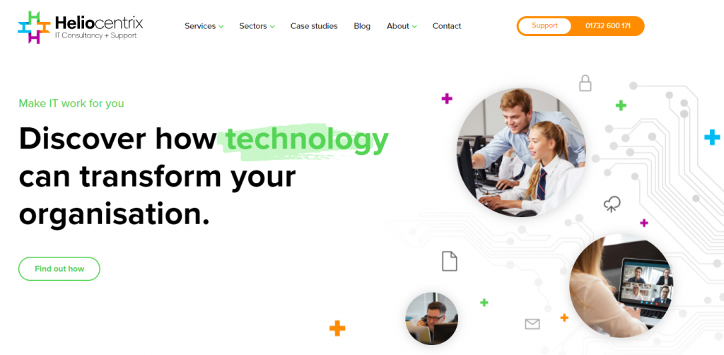
Of course, once we had our new brand, the natural next step was to update our website. As you can see, we have a fresh new look and have improved the content of the website to give you clearer information on the services we offer.
A bright future
Our bright new look symbolises the positivity of our business as we look to a future of continuing to serve our clients with only the highest standard of support. We hope you like our facelift as much as we do.